Brick House
Location: Mar Azul, Buenos Aires Province, Argentina Project Design: María Victoria Besonias, Guillermo de Almeida, Luciano Kruk Land Area: 595sqm Built Area: 118sqm Construction year: 2007Location: Mar Azul, Villa Gesell, Buenos Aires, Argentina
Architecture Studio: BAK arquitectos
Design and Project Management: María Victoria Besonías, Guillermo de Almeida, Luciano Kruk.
Land area: 595sqm
Built area: 118sqm
Construction year: 2007
MEMORY
María Victoria Besonías
The commission
The clients had inhabited the Mar Azul House and, after that experience and defining their own, one of them said: “I want my house to be of exposed brick. The roof can be like yours, flat and of exposed concrete”. Then they added: “We want two bedrooms, two bathrooms (one en suite), a grill near the house and a small deposit. Rooms have to be generous, low maintenance and adjusted cost, otherwise you remain absolutely free to propose”.
The proposal
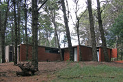
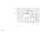
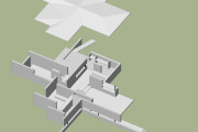
“Brick House,” said textually the client. Immediately, this phrase became associated with the image of the project plan (unbeatable in our opinion) for the Brick House by Mies van der Rohe in 1924. We should then assess whether this could be useful compositional order to solve this request. Quickly we agreed that the spatial continuity between sectors generated by the perpendicular planes of Mies and the ambiguous relationship established between the interior and exterior were appropriate to solve this house, with a quite undefined program and located among the pines on a dense forest. The task was then to scan the drawing of the master and use it as a matrix of proportions to test if the program worked uneventful. In a few moves the different functions were finding placement without difficulty. Remained only, through a process of translation and rotation, locate the house on the site fulfilling the rules and trying to bring down the fewest pine trees. No one in the studio recalled any other data from the Mies house more than the plan, so that the elevation was free from literal influences.
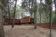
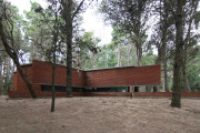
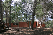
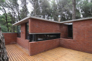
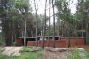
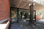
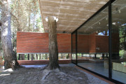
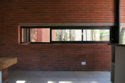
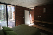
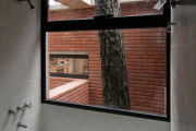
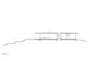
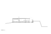
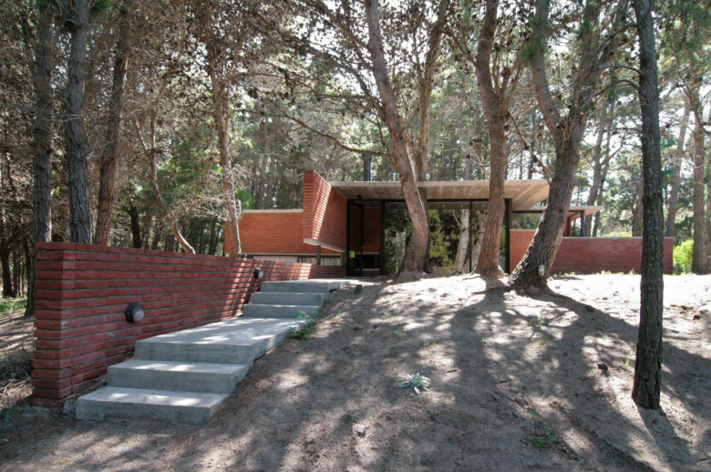
We then proceeded trying to rid ourselves of preconceptions about the use of brick, assuming that we had imposed a material but not a building system to determine the resulting language. The purpose was that this series of brick walls would be trimming and perforating without losing its quality of plans and establishing a dialogue with the environment in contrast. The abstract matrix should overlap the organizational freedom system of the forest without generating any conflict. Thus the house was projected at the top of the lot (the sector with less pine trees) rather sunken and the minimum height allowed making its presence less noticeable. The two most prominent planes in the plan of Mies lose height so as not to divide the lot without losing protagonism, since they accompany the stairways that save the slope respect to both streets. The roof is another plane that takes part of the walls and is perforated to make way for a tree when necessary. From the interior, the forest is always present trimmed in the openings that allow distant views and to very narrow corners, views over the treetops or, on the contrary, views that led to the mantle of dry leaves covering the forest floor.
Finally it was decided not to landscape the lot to maintain the quality of the natural scenery, which has also the advantage of not requiring more maintenance than the removal of the pine trees when they dry.
The functional organization
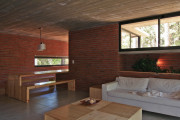
It’s defined by three distinct areas linked by a foyer. The social sector (dining room-kitchen) on the one hand, the sector main bedroom with bathroom and toilet on the other, and a guest bedroom with shared bath as a third area. From every room there are several forest views and three trees are incorporated in the construction: one in the large partially covered access, another in a tiny courtyard that provides light and air to the foyer and the shared bath, and the last in the exit overhang of the guest bedroom.
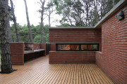
The main entrance is over the street that presents less difference in level within the lot and that difference is saved and extended with a narrow staircase that accompanies a low wall, which is present inside after crossing the glass door hidden in a large pane of glass that reflects the landscape. The secondary access is also via a stairway, this time more steeply and again accompanied by a wall that forms the area of grill and deck.
The constructive solution
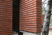
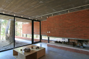
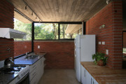
The bearing walls are exposed brick both outside and inside. This was essential to maintain the plane running through different areas without losing its identification as such. We understood that the solution for openings in a bearing wall are narrow openings, but we did not want to lose the forest’s horizontal views (we had experienced with other work in the same environment that they were interesting), so we decided to force a constructive resolution with a beam hidden inside the wall and resting on columns of iron bars embedded to woodworking that allowed us to have unlimited openings in its horizontal extent. On this wall rests a slab of exposed concrete beams resolved with ring beams, again to strengthen the character of the horizontal plane with runoff slope to the four sides, settled at the same time of the slab fill in.
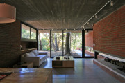
The interior walls are plastered and painted bricks with white latex. The floor is ceramic glazed without base, as the encounter between wall and floor is solved in an ashlaring. The openings are of dark bronze anodized aluminum. The heating system, since there is no natural gas in the area, was solved by building a generous fireplace to acclimatize the gathering place and the main bedroom. It was also installed a salamander in the foyer and reinforced the heating in the guest bedroom and bathroom with electric plates. Future maintenance is of very low incidence and only must be re waterproof the exterior brick walls.
The light treatment
Knowing the surrounding atmosphere generated by the forest (lots of shade and low incidence of orientation) we knew that we could reach the ground with openings extended to all corners of the house. Despite of it, at times it was necessary to supplement with artificial light, as brick walls have no opportunity to reflect the low ambient light. Artificial lighting was designed with rails that allow adding more lighting devices, if necessary, and with some directional lighting devices.
The furniture
The fixed and movable furniture specially designed for this house was made from recovered Canadian pine which comes from boxes of package’s engines.

